An easy pose and some coloring fun before school starts up again. Work has gotten really busy. At one point there was a tour group, a bridal party and and a group buying $70 in admission all wanted my attention at the same time. The person who assists events isn't going to show up until they're scheduled, and I think the wedding party arrived way earlier than planned.
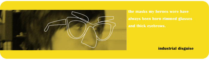
Blustery Day by ~aeater on deviantART
Saturday, March 21, 2009
Thursday, March 12, 2009
Winter Quarter 2009 Summary
Hello Spring Break. There's some intense banjo playing going on in my backyard, so I'll keep this brief. My final is finally over, so that means some glamour shots:

Now it's time to figure out how to sleep with all that celebration going on outside.
ETA:
I'm awake from my post-final coma. The biggest criticism my class received as a whole was not summarizing our projects effectively enough. What I wish I had said:
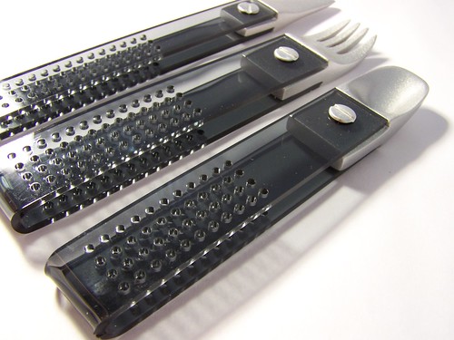
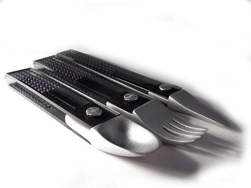
My final model reflects the physical styling found in the core product line of the Bodum brand. The majority of the flatware is made up of a transparent material. It has three distinct elements, the black plastic handle, the aluminum screw posts and the stainless steal utensil heads. It uses the perfect circles found in their strainer as a graphical element, much like their toaster does. By referencing these physical elements, Bodum's customers recognize this silverware set as being part of the brand's product family, and through its relationship to Bodum's core product line, participate in the experience of quiet contemplation and relaxation.
Saturday, March 7, 2009

My ACCE final! When I signed up for the class I thought I would spend the next three months drawing shoes and watches. I was sad when I found out I also had to draw things that were not shoes and watches.
For the final, I started wondering about acorns and how they attach themselves to trees, and that grew to include a cherry and then a grape, I guess. I want to redraw that first purse so it's in an aggressive 3/4 and not a flat 1/8 like I've got it now.
Thursday, February 26, 2009

Tuesday, February 24, 2009
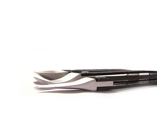
Bodum Flatware!
The sketches for my brand identity project! We chose a company to do a brand analysis for. Once that was done, we chose a product line to introduce to their family of objects. I chose Bodum, and I wanted to apply their aesthetic to flatware.


This is the set I'm going to produce. I took the very iconic form of the handle style Bodum uses for their coffee presses and extruded it. I've also brought in the hardware used on those products. It's sort of the reverse of those open air flatware that's out there. The material choices: aluminum and black acrylic, but I will paint foam to look like aluminum because I don't want to spend so much money on an appearance model if these won't get kept out for display.
This is the set I'm going to produce. I took the very iconic form of the handle style Bodum uses for their coffee presses and extruded it. I've also brought in the hardware used on those products. It's sort of the reverse of those open air flatware that's out there. The material choices: aluminum and black acrylic, but I will paint foam to look like aluminum because I don't want to spend so much money on an appearance model if these won't get kept out for display.
Sunday, February 22, 2009
Proud and Flow
Every form falls on the spectrum of Proud or Flow. Proud being composed of geometric, static, regular, angular and bulky forms, while Flow is more organic, slender, and dynamic. So it's a great exercise in emotive form with the bonus of seeing which end of the spectrum your aesthetic falls. This has been the assignment given to every Studio 1 class for at least four years.
My class did not do Proud and Flow. We did Historical Forms instead, but there were a lot of Proud and Flow forms anyway. The way Historical Forms work is that each person in the class was given a decade to derive themes from, and then to manifest those themes into a three dimensional sculpture.
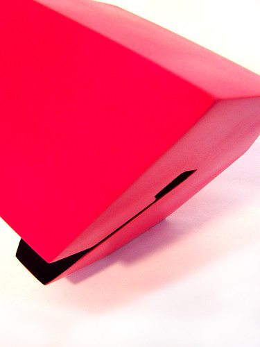
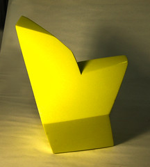
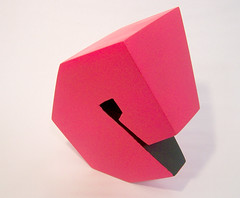
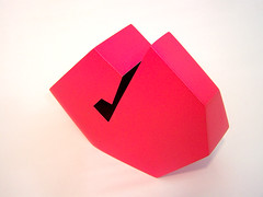
I had the 1980s. I was disappointed with my assignment at first (Reagan, mauve, and shoulder pads, really), but I got really into it during the research phase. The themes I came up with were Bravado and Insecurity.
Bravado
The 80s mainstream culture was all about Machismo. In fashion, there were masculine silhouettes everywhere, most notably through shoulder pads. Ralph Lauren got his start by selling that sporty look to non-athletes. The Armani power suit was the must have outfit for the corporate climber. Everything was an expression of power and competence. Here I've tried to incorporate that silhouette while maintaining that 80s prismatic aesthetic.
Insecurity
The flip side of Bravado is Insecurity. Because the country had the looming threat of Communism, the highest unemployment rate since the great Depression (or until recently), and the Savings and Loans fall out, it was natural not to feel confident about the nation's future. I looked at forms in nature for inspiration. In forms that have a protective function in nature (shells and horns) the spiral occurs frequently. In fact, the ultimate act of insecurity for a human being is to curl up into the fetal position. From the front, it's that very dramatic V-shape silhouette, and from its profile, you get the spiral shape. This is my favorite of the two because of the pathos that people who interacted with it showed.
From certain angles, it has a really playful form. Like a dog or a cat that wants a belly rub.
This project was a lot of fun, even if I'm not the best at making physical models.
Sunday, November 30, 2008
Fall Quarter Summary
This was the quarter where I learned about graphic design. If it's true that the head of the department hauled ass to remove any traditional graphic design courses from the curriculum, then Human Factors is the unofficial graphic design class for Industrial Design. What I've been up to:
Anthropometry Study:

I was trying to channel subway map layouts with little success. This was full of novice mistakes like forgetting to line up the elements and not making good use of space. I was really happy with it when I first finished but now I am of a different opinion.
Anatomy Study:
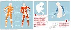
There are elements from both the first draft and the final that I like. I like the tabs in the first one, but I liked the economy of space of the second one more.
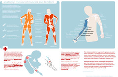
Final Ergonomic Study:
This could probably use more tweaking but for now I'm pretty satisfied with it.
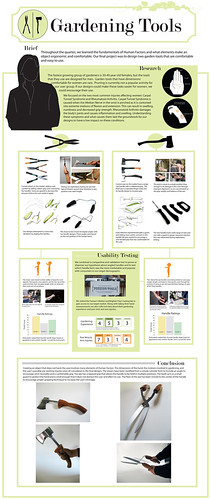
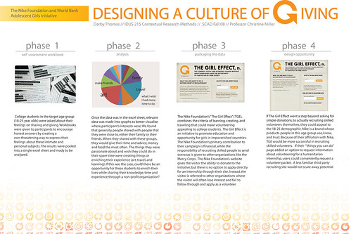
Contextual Research is another course where I spent more time in front of the computer than in the shop:
Flow Model:
This was easily ten hours, not including field research. I remember refusing to put any content in it until I figured out how I would style everything. That attitude resulted in so many hours pissed away just picking out the fonts.
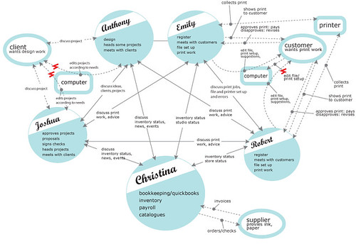
Survey Project:
I tend to lean towards simple layouts with clean graphics. Right now everything I do feels pretty plain, so in the future I want to try to avoid flat colors and simple shapes.
Anthropometry Study:
I was trying to channel subway map layouts with little success. This was full of novice mistakes like forgetting to line up the elements and not making good use of space. I was really happy with it when I first finished but now I am of a different opinion.
Anatomy Study:
There are elements from both the first draft and the final that I like. I like the tabs in the first one, but I liked the economy of space of the second one more.
Final Ergonomic Study:
This could probably use more tweaking but for now I'm pretty satisfied with it.
Contextual Research is another course where I spent more time in front of the computer than in the shop:
Flow Model:
This was easily ten hours, not including field research. I remember refusing to put any content in it until I figured out how I would style everything. That attitude resulted in so many hours pissed away just picking out the fonts.
Survey Project:
I tend to lean towards simple layouts with clean graphics. Right now everything I do feels pretty plain, so in the future I want to try to avoid flat colors and simple shapes.
Subscribe to:
Posts (Atom)